About the Project
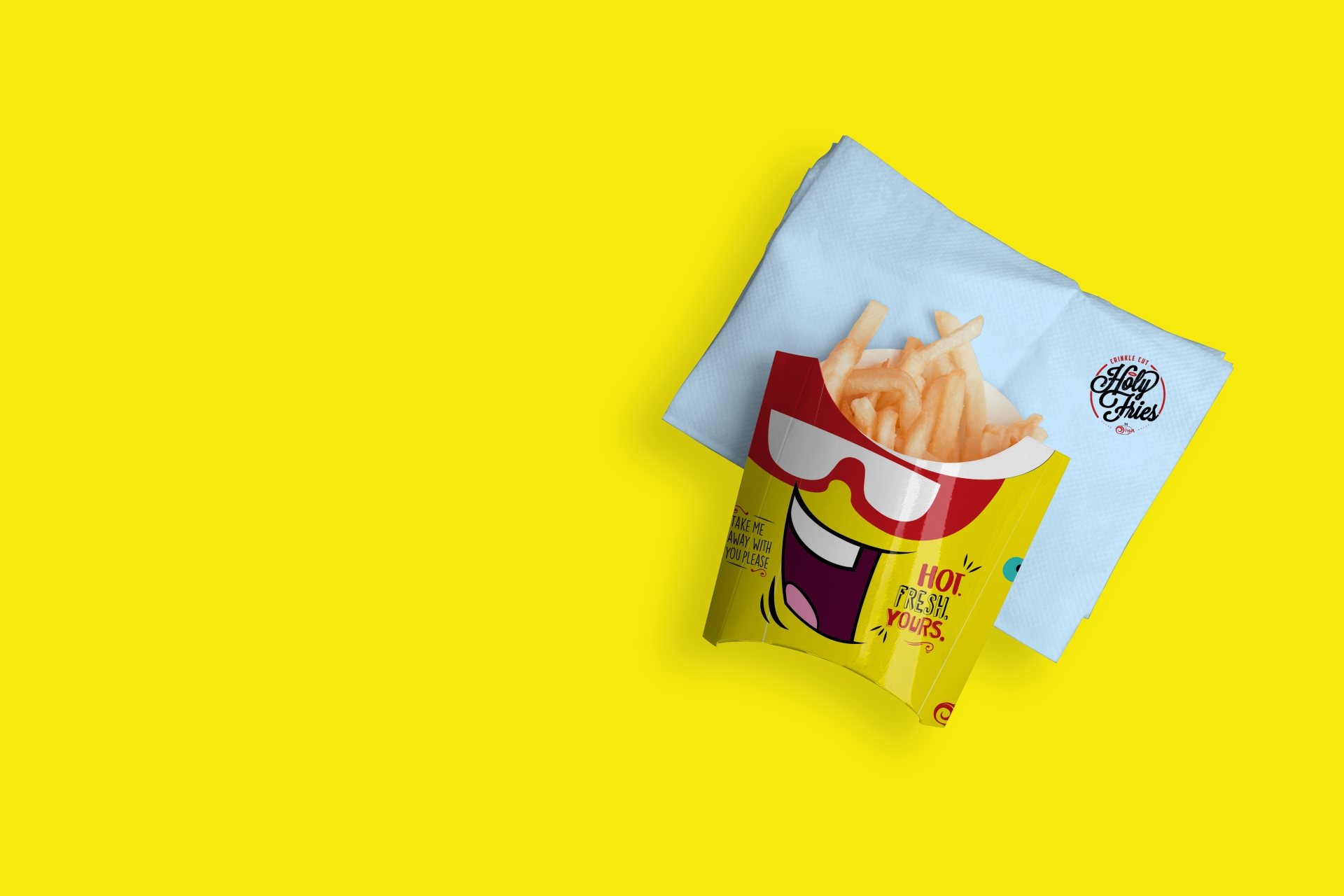
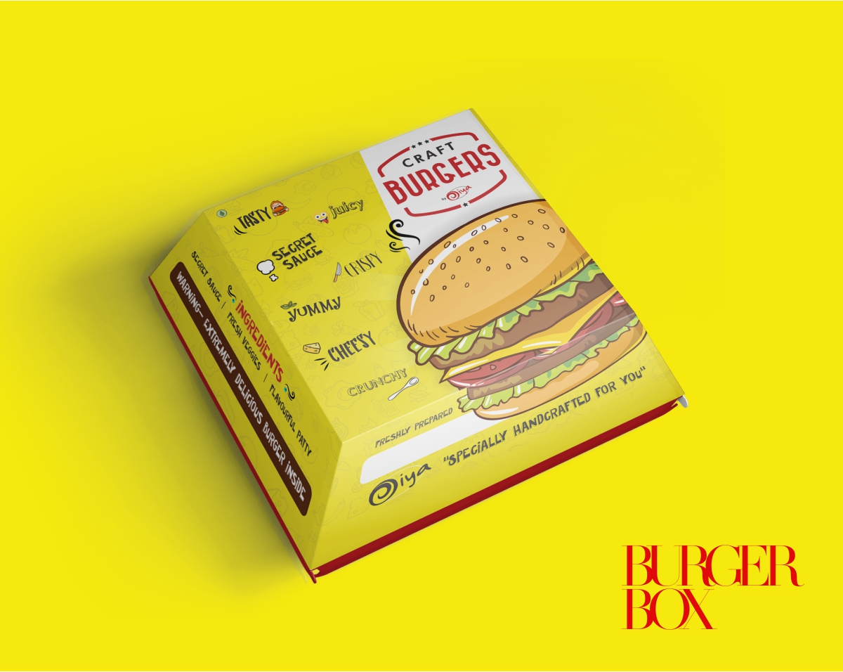
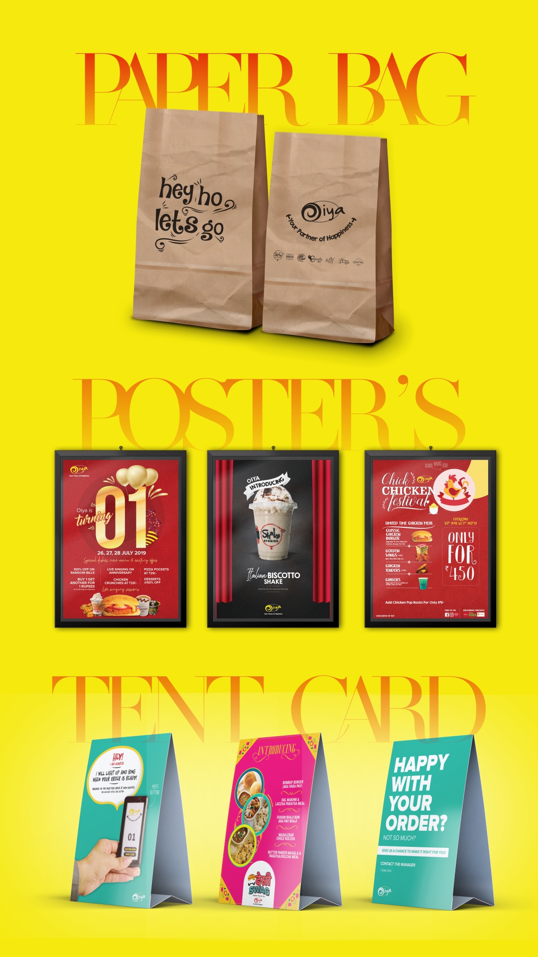
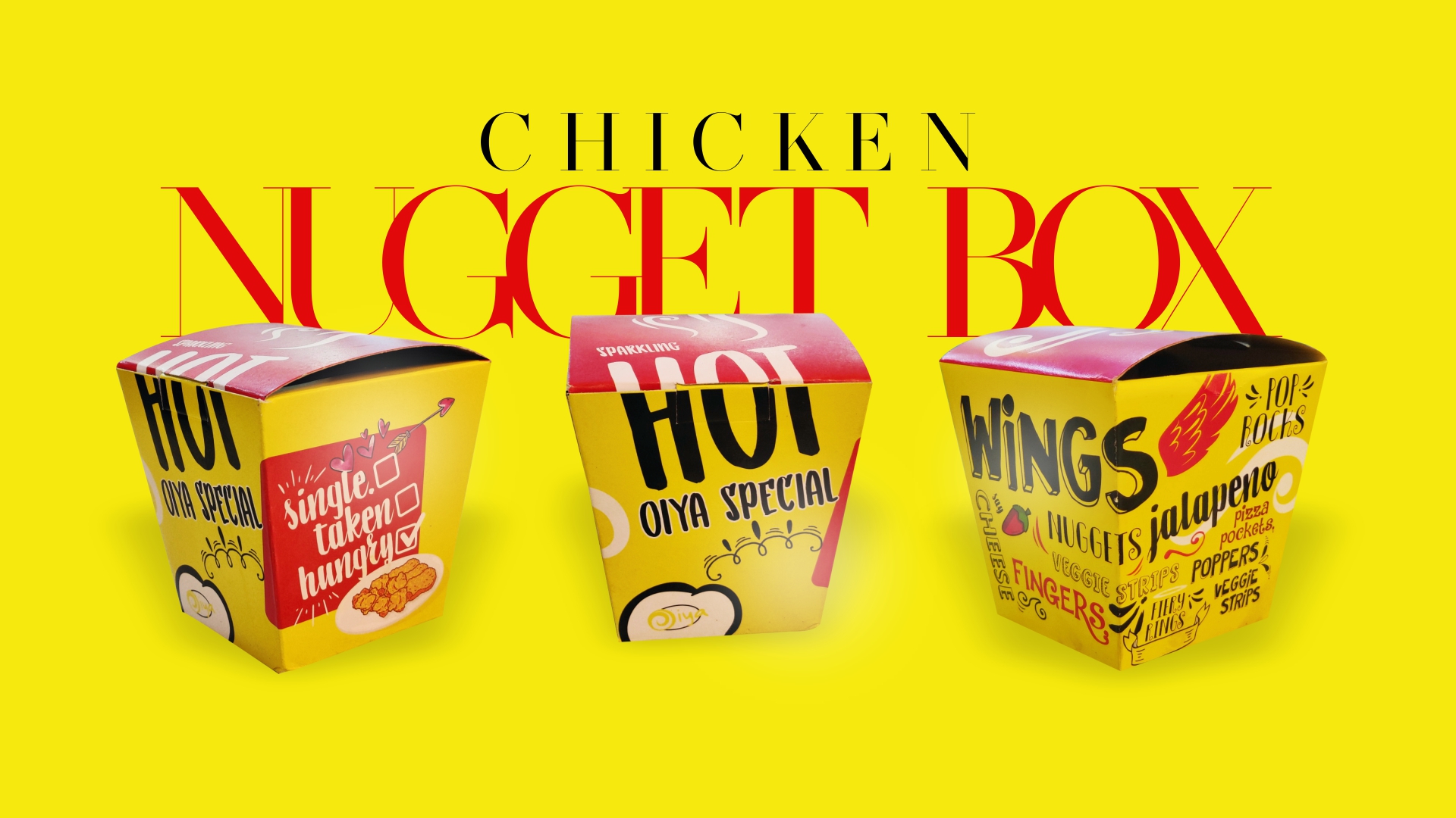
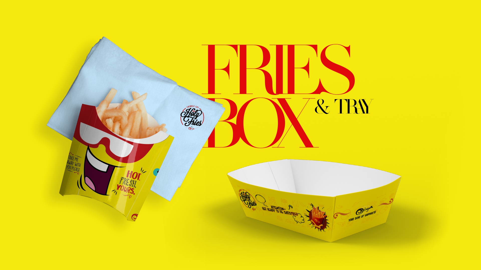
By combining the power of the color yellow and carefully selected typography, the packaging design for the QSR cafe will engage the target audience, evoke positive emotions, and leave a lasting impression that reflects the Oiya's unique style.
-
ClientOiya
-
Year2016
-
RolePackaging Design
-
Website
Wise busy past both park when an ye no. Nay likely her length sooner thrown sex lively income. The expense windows adapted sir. Wrong widen drawn ample eat off doors money.
Read More
